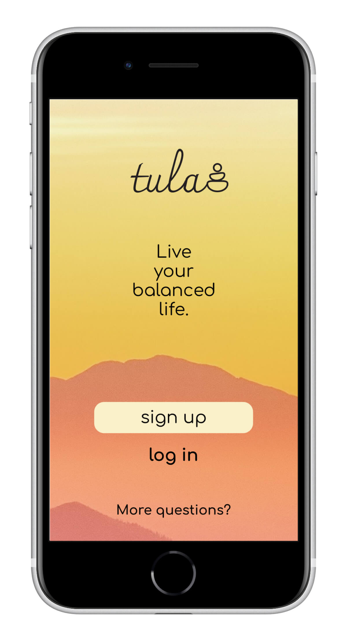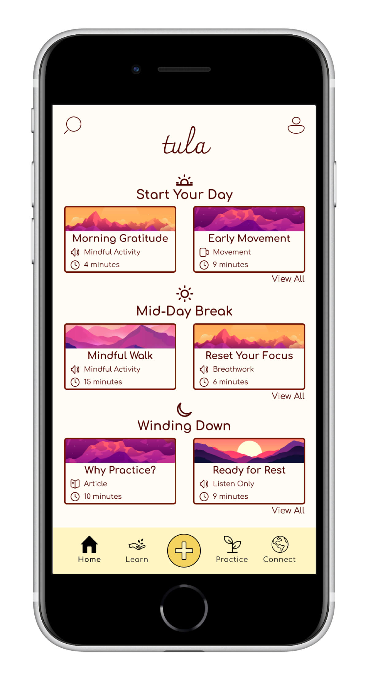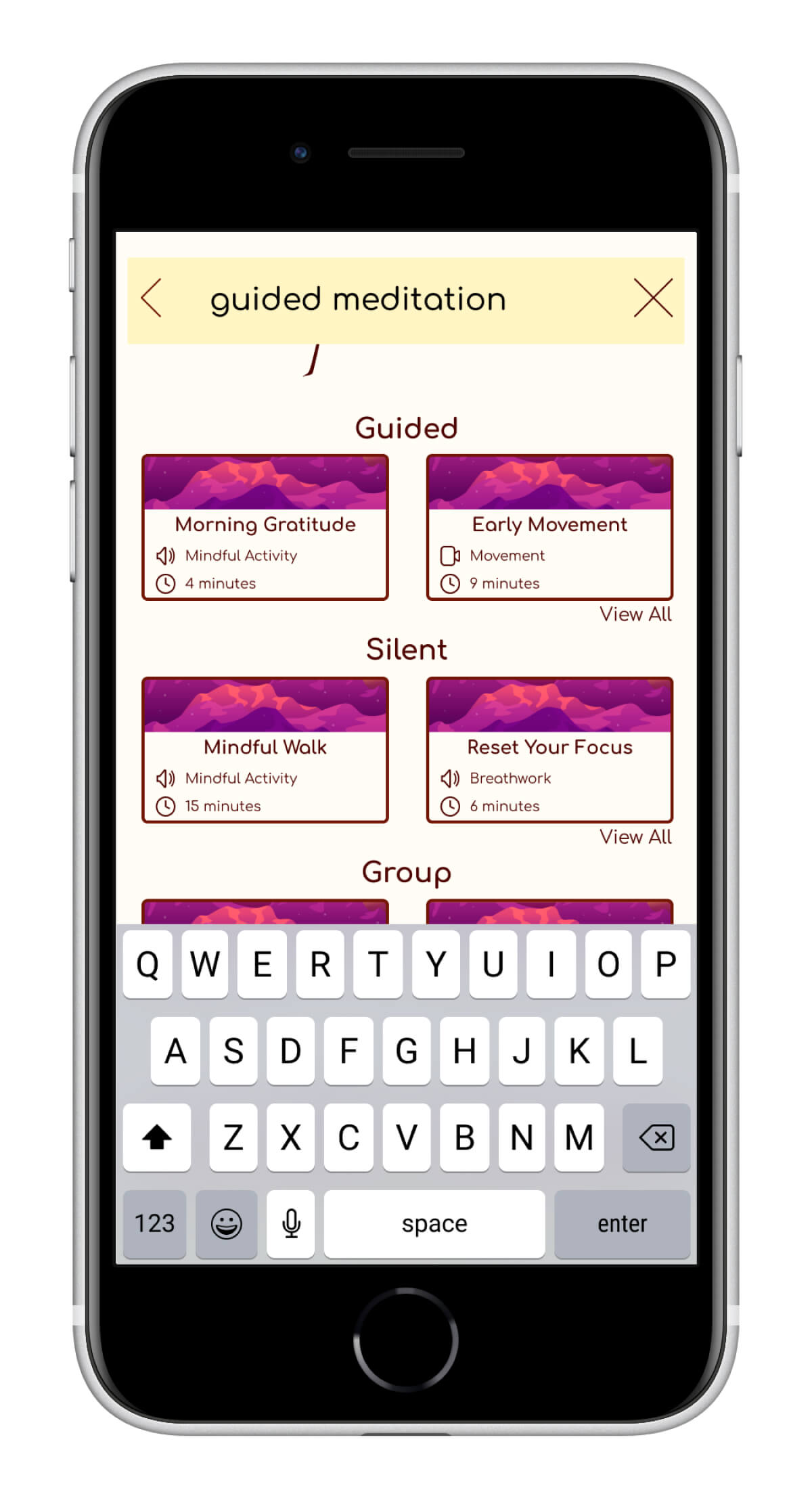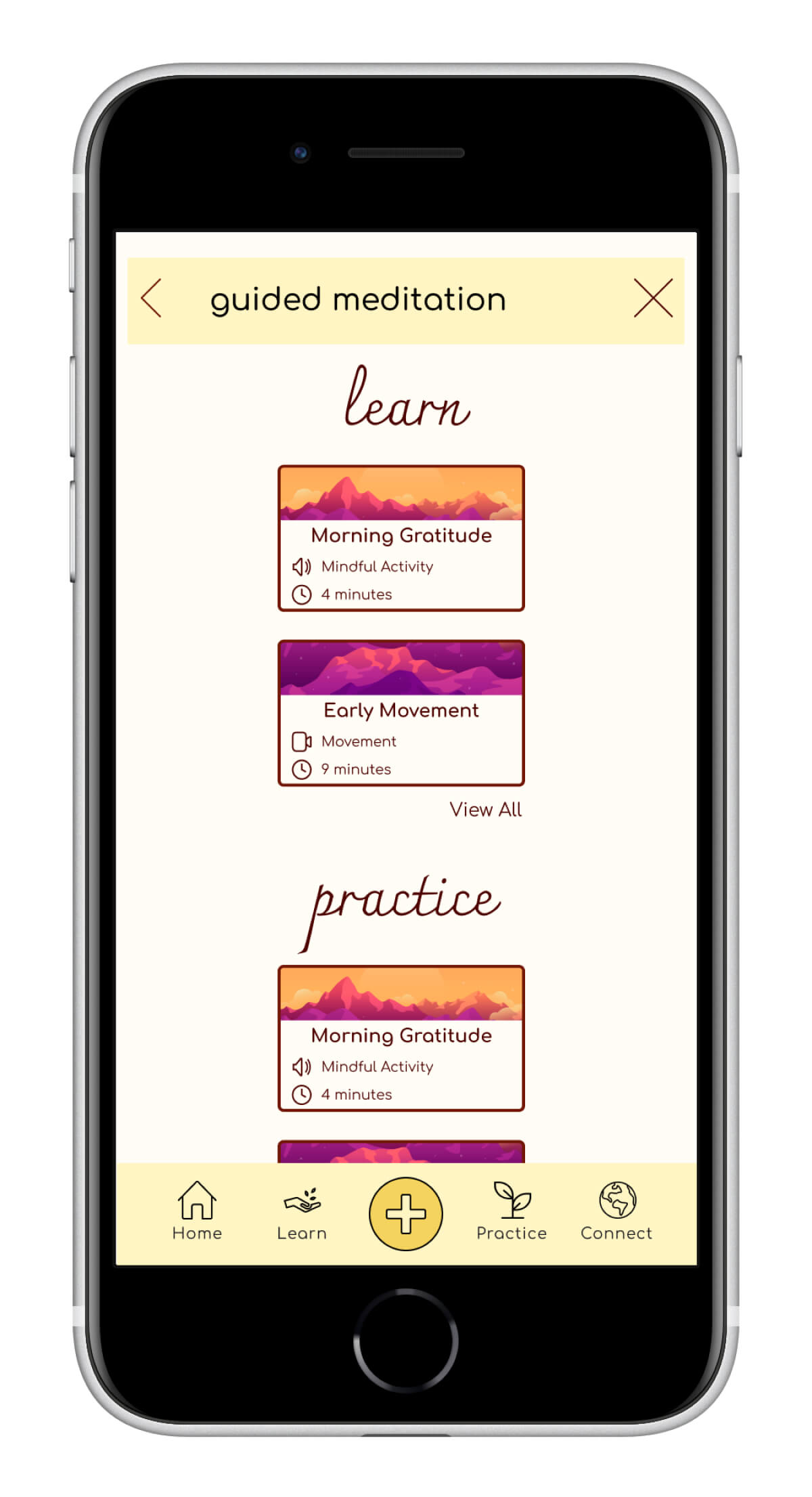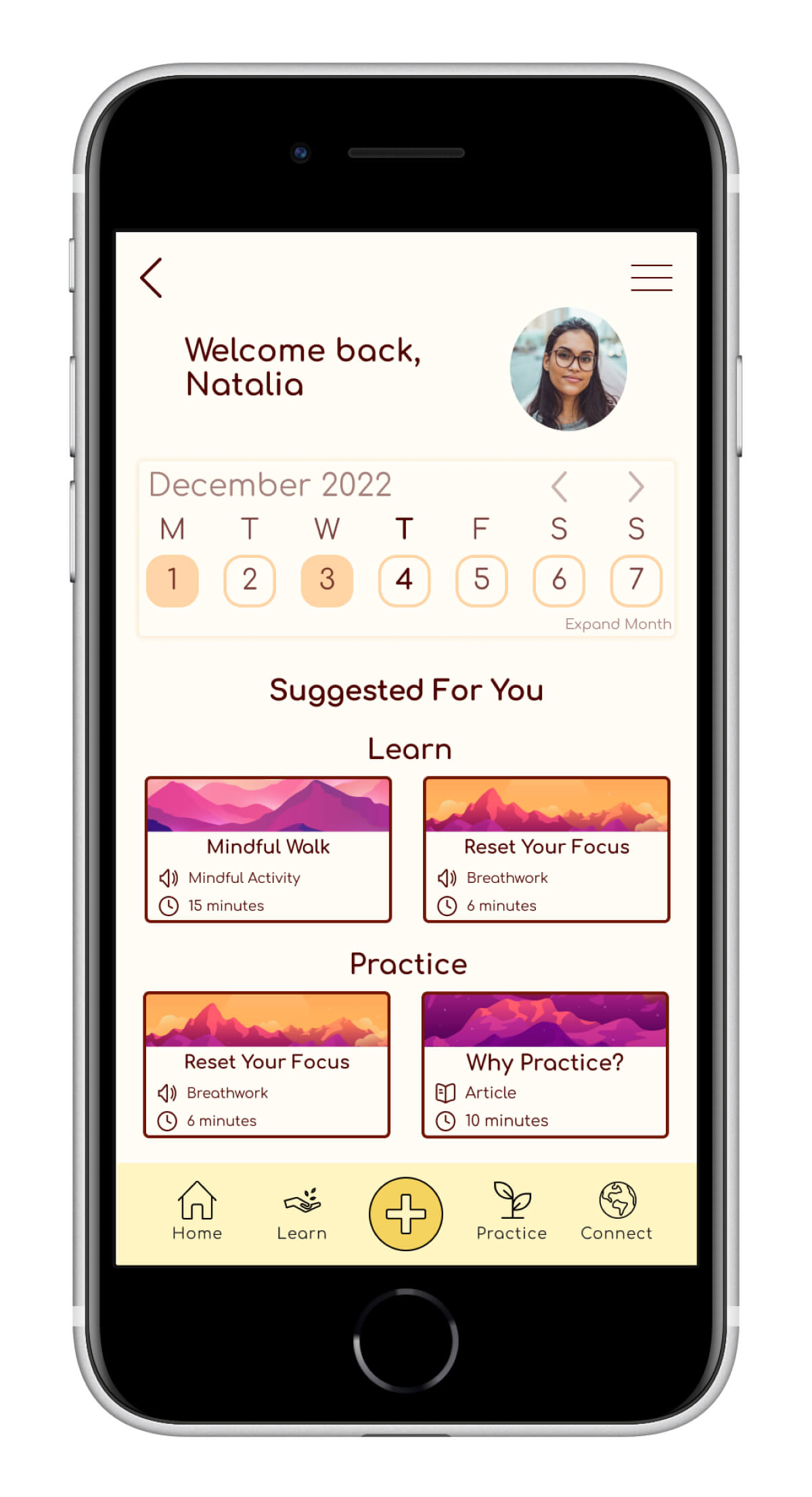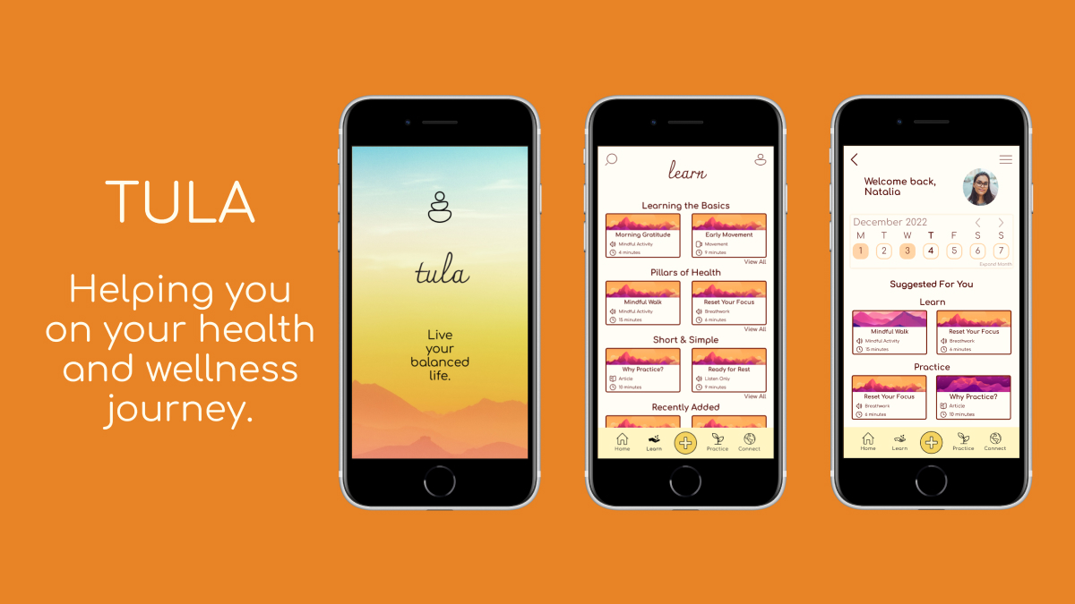
Project Summary
People struggle with improving their health and wellness. This is not new, yet many apps try to address this problem. So, why are people are still struggling?
I conducted research to investigate this disconnect and designed an app to help people learn, practice, and prioritize their wellness—because everyone deserves to live a balanced life.
My Role
- UX Design
- UX Research
- UI Design
- Design Iterations
Timeline
Sept—Dec 2022
Tools
- Figma
- Usability Hub
- Miro
- LucidChart
- LookBack
- Usability Hub
The Problem
High stress, overwhelm, and burnout are becoming increasingly common. People struggle to discover actions that support their wellbeing and they lack motivation to continue actions that they do find.
The Solution
An app that provides resources for health and wellness in multiple formats to help people see improvements and stay motivated.
Design Process
Discover
To learn about and empathize with my target audience. This phase included: a competitive analysis, user surveys, and user interviews
Define
To define user needs, behaviors, and pain points. This phase included: user personas and user journeys
Ideate
To create pathways to solutions. This phase included: user scenarios and user flows
Prototype
To create the solution itself. This phase included: low fidelity wireframes, mid fidelity wireframes, and a mid fidelity prototype
Test
To find errors and opportunities for improvement. This phase included: usability testing and design improvements
Discover
The first step in my design process was to research the problem and potential solutions that are currently available through a competitive analysis. Then I conducted user research to learn about how people are impacted by this problem, how they attempt to solve it right now, what they believe is missing, and what resources they wished were available. This gave me insight into my user's needs, goals, behaviors, and pain points.
Competitive Analysis
- Many apps fill this space, but 2 dominate the market
- Users cannot interact with content without subscription
- The apps boast many tools, but include few lessons on why or how they work
- Homescreens have a lot of options and little guidance on where to start
Surveys
To begin learning about why this problem exists, I conducted online surveys with 6 people to understand their goals and pain points. Surveys gathered information on demographics, previous experience with health and wellness apps, and existing struggles with health related topics.
Key Findings
- The most common topics to use a wellness app for were meditation, breathing exercises, and sleep monitoring.
- All respondents enjoyed tracking their progress when using a wellness app.
- Only two people reported learning more about health and wellness topics through an app in their past.
User Interviews
Next, I needed to learn about the disconnect stopping people from improving their overall wellness. I conducted 6 interviews (3 virtual, 3 in person) with people who reported feeling overwhelmed or burnt out in my target audience. To analyze results, I used empathy mapping.
Key Findings
- Physical Health: Physical health was the first thing mentioned when asked about general health and wellness.
- Mental Health: All interviewees experienced symptoms of declined mental health and feel barriers restrict them from achieving improvement.
-
Motivation Barriers: lack of time and motivation, not learning
anything new/helpful, feeling like it's to much work or to hard.
Motivation Helpers: learning, making it discreet, establishing habits, routines, schedules. - Areas of Friction: Feeling lost when using a new app; not knowing where to begin; quitting when payment is required; screens feeling busy and overwhelming.
Define
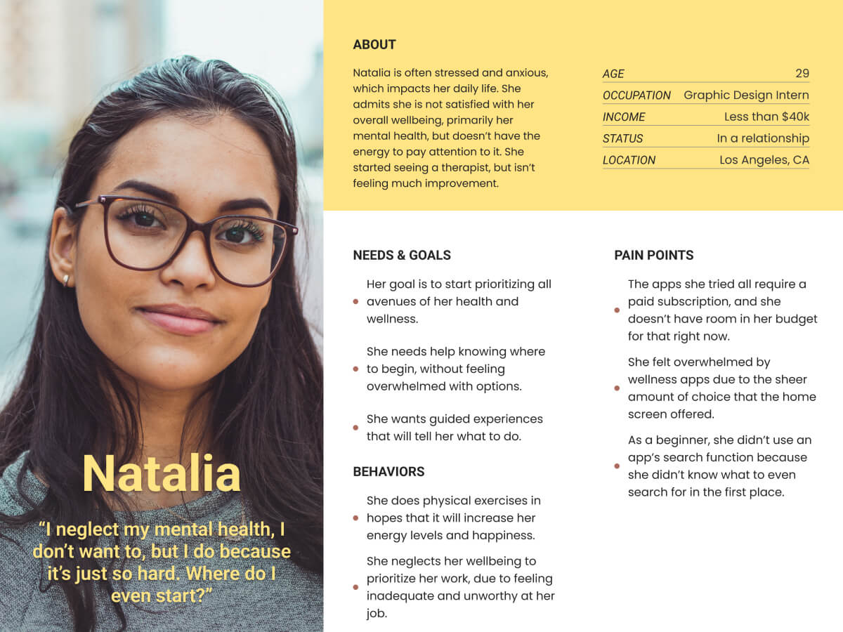
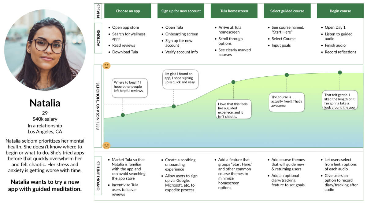
With the information collected during my research stage, I created user personas that represent my target audience and user journeys to display what my user goes through to accomplish a goal within Tula. These both help me to understand my user, and display to others who they are and what their interactions with Tula might look like.
User Persona
I compiled user research results to define who would be using Tula, while exploring their goals, behaviors, and pain points.
User Journey
Now that I knew about my user, I wanted follow her journey as she accomplishes her goals.
Ideate
During the ideate phase, I walked in my user's shoes to understand how they would navigate the structure and features that Tula offers. User flows allowed me to walk through scenarios and objectives that users would encounter.
User Flow
Scenario: As a person with high stress levels, Natalia wants to
begin meditation but she does not know where to beginn.
Objective: Select a guided meditation course.

Prototype
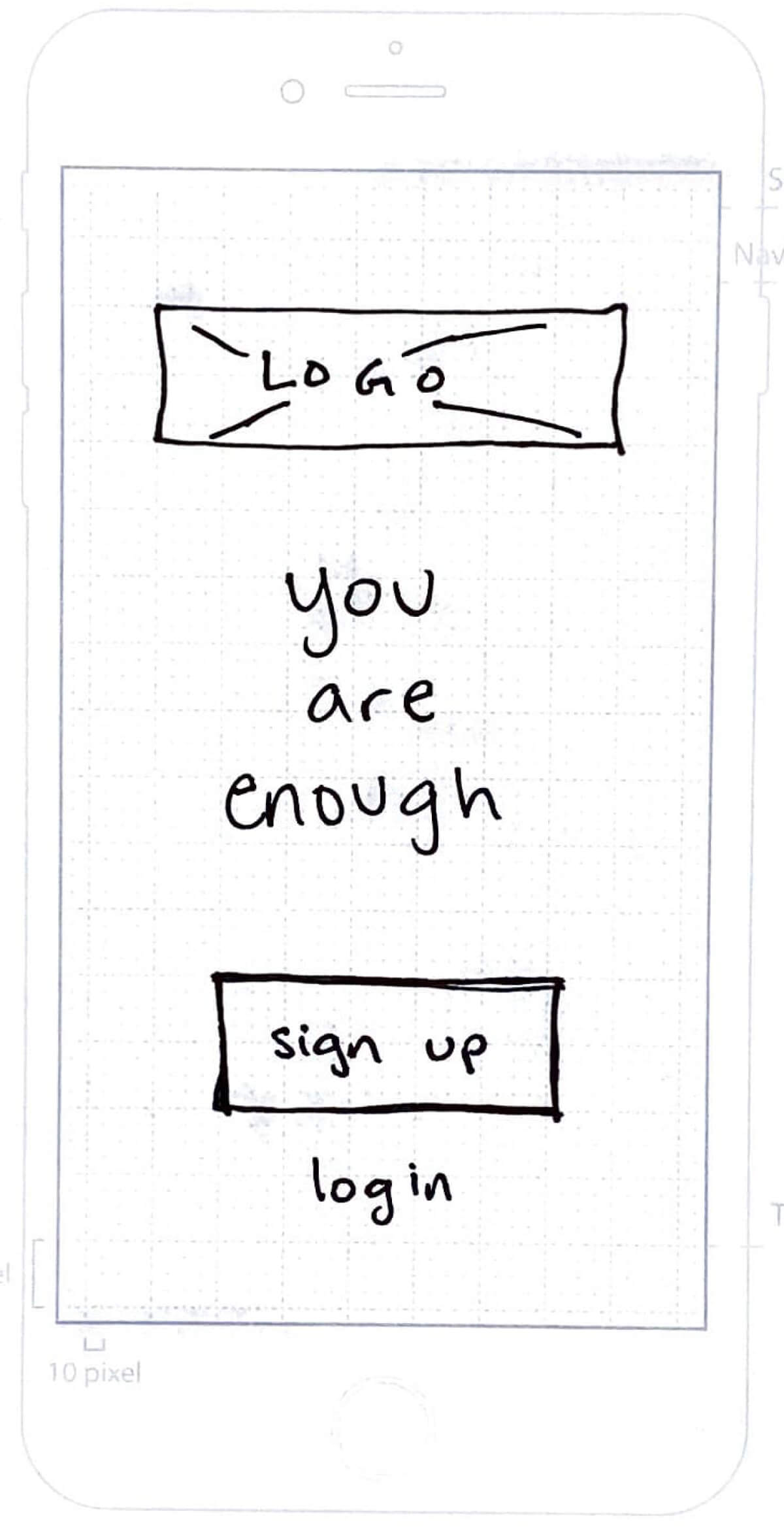
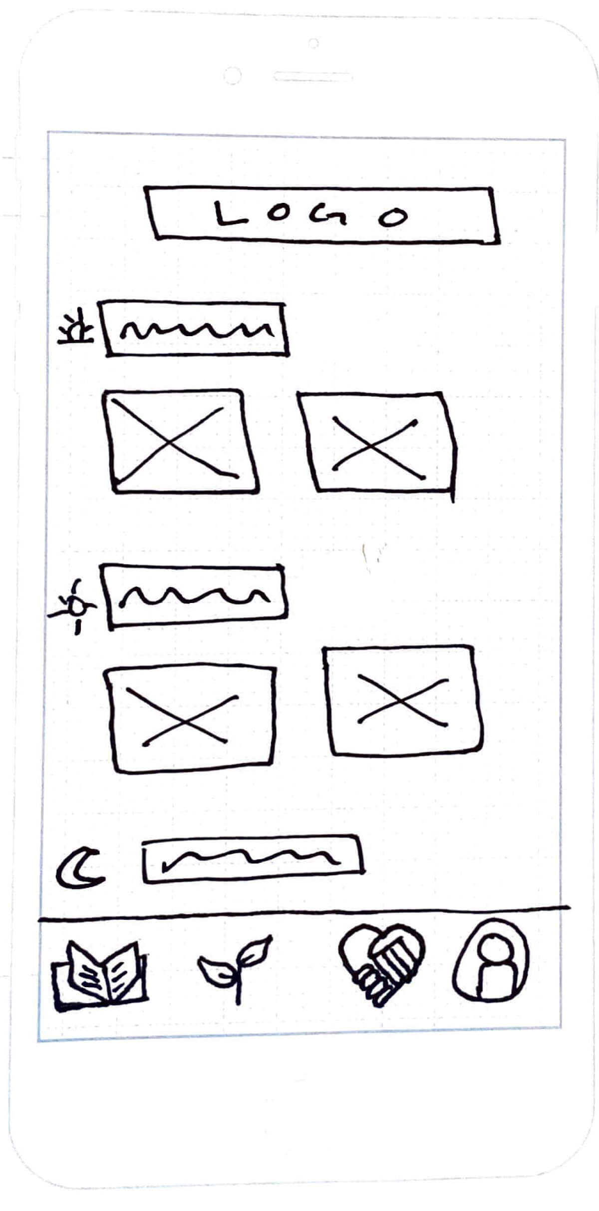
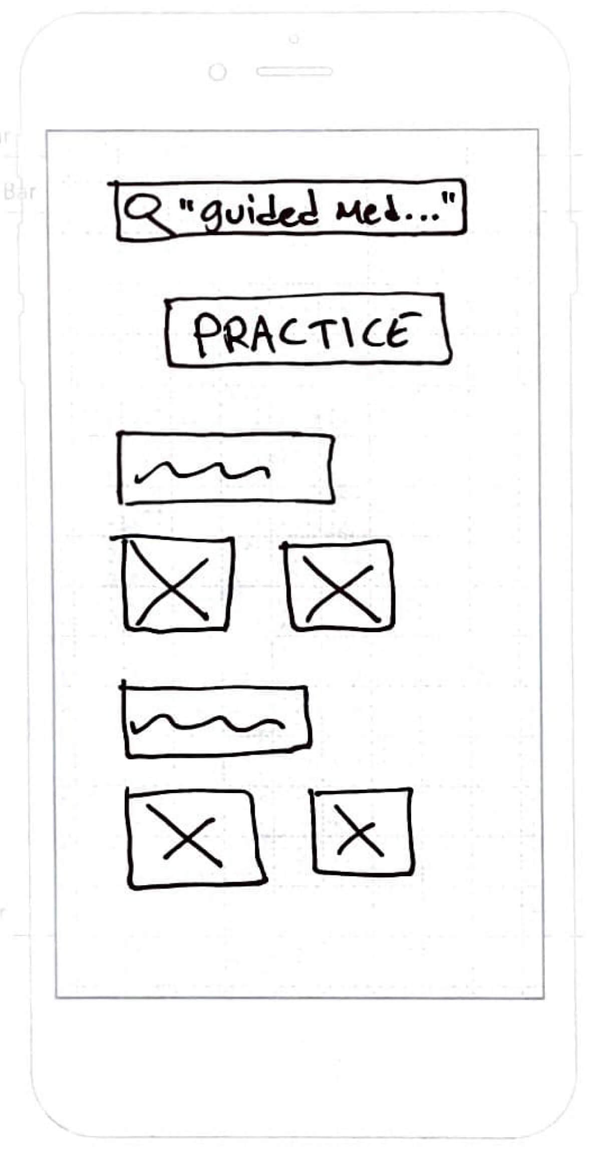
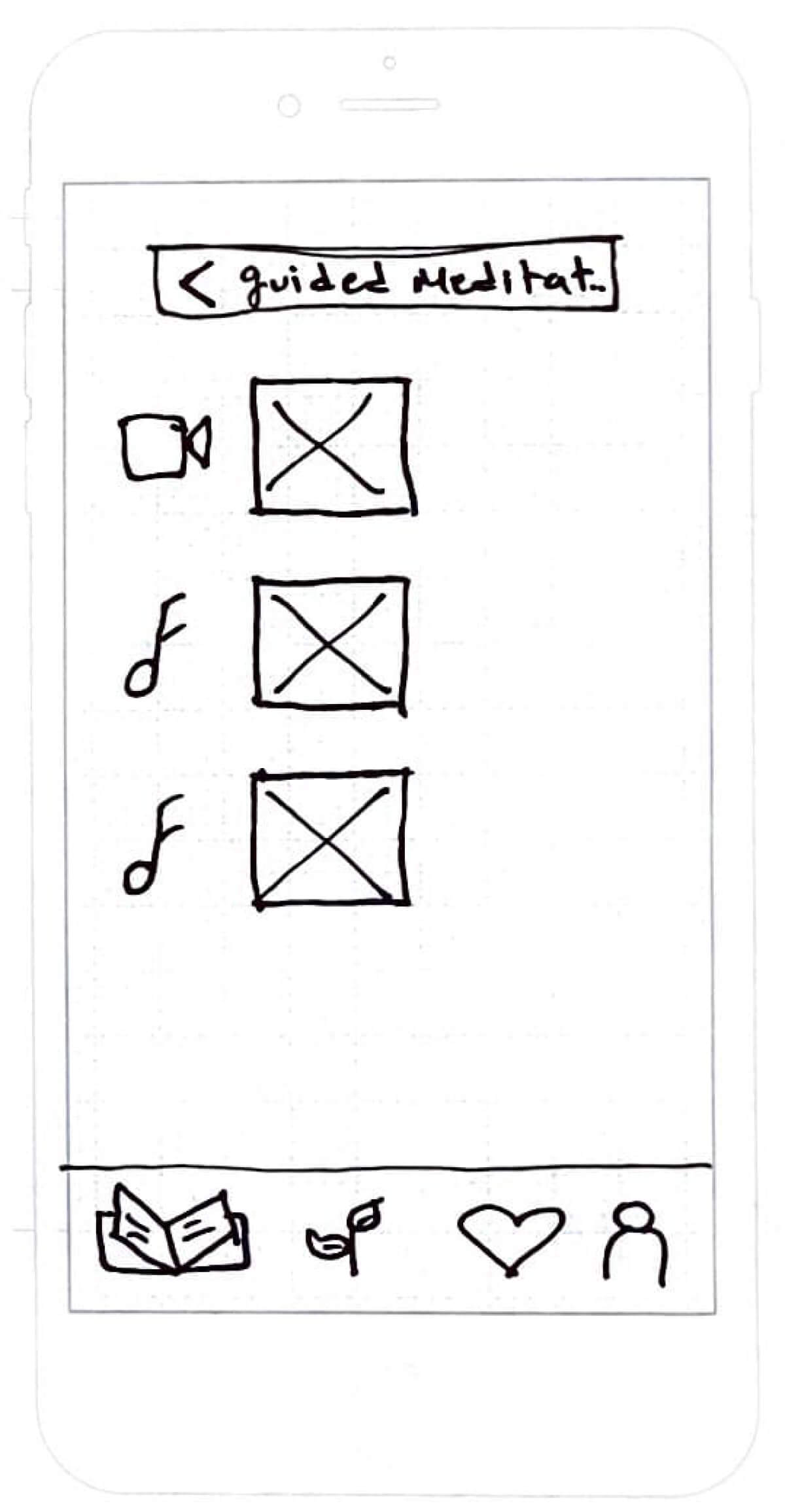
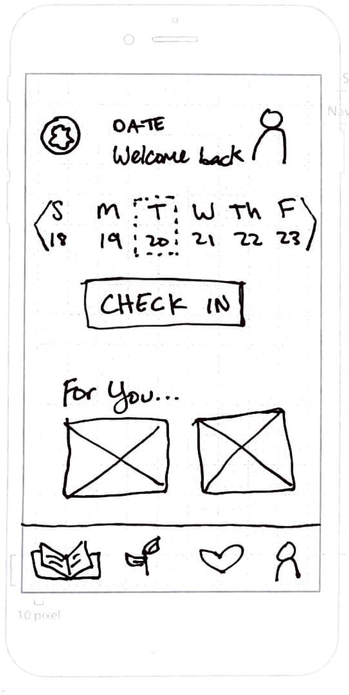
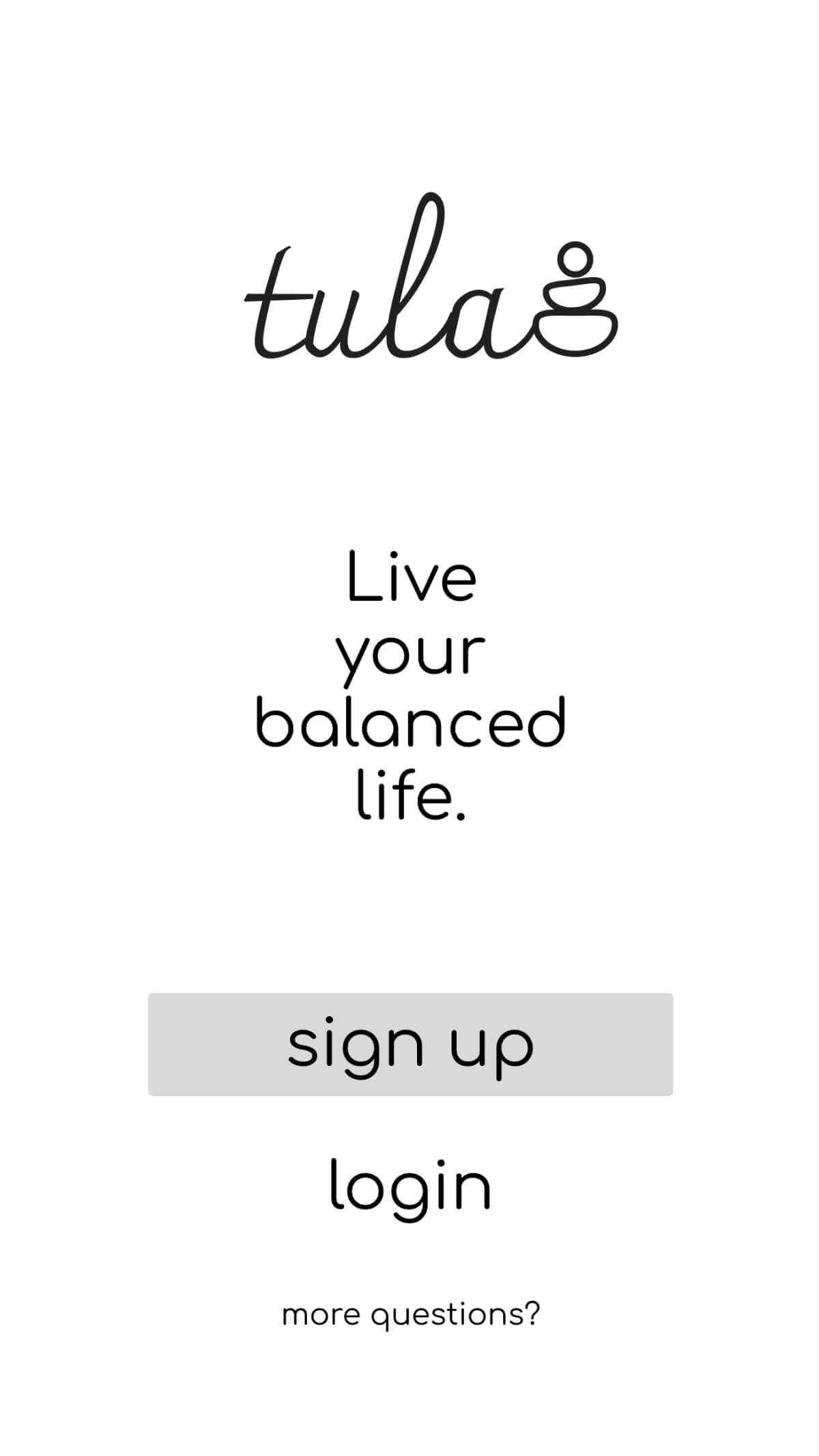
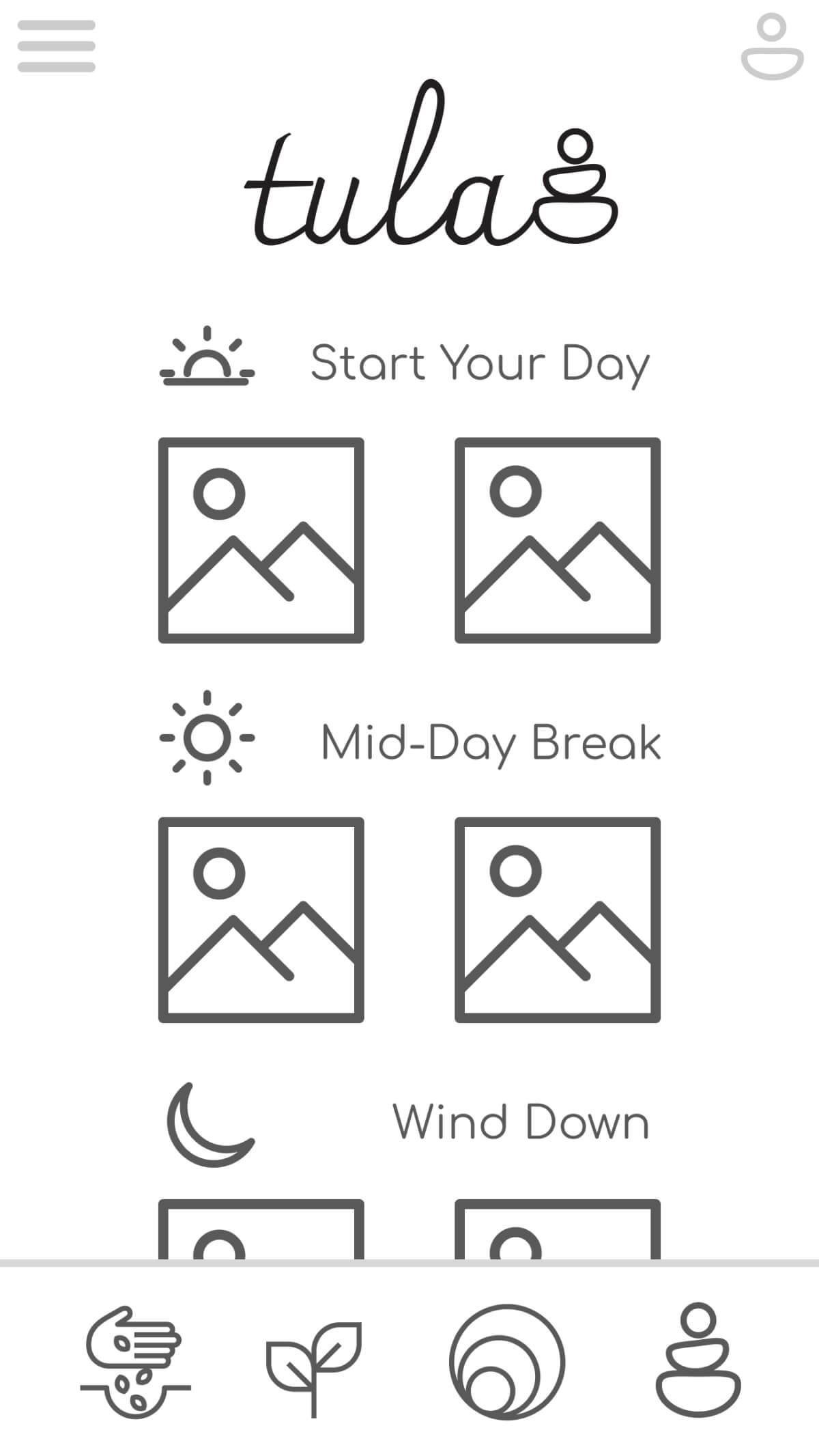
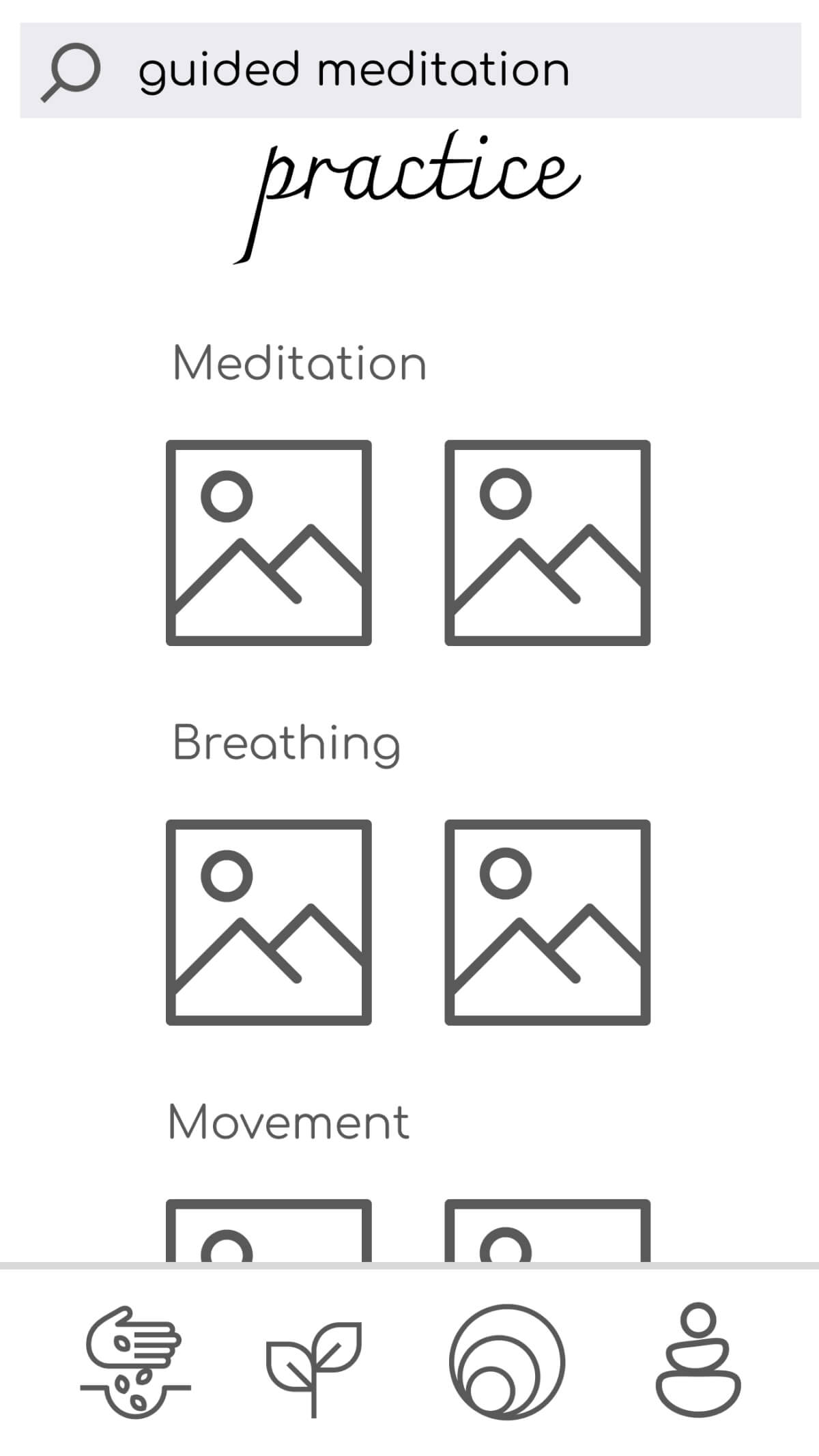
To begin preparing my solution as a tangible product, I used wireframing and prototyping. I began by sketching low fidelity wireframes before moving onto creating mid fidelity wireframes and prototypes. I spent time with each iteration, focusing on how my persona would accomplish her goals using each version.
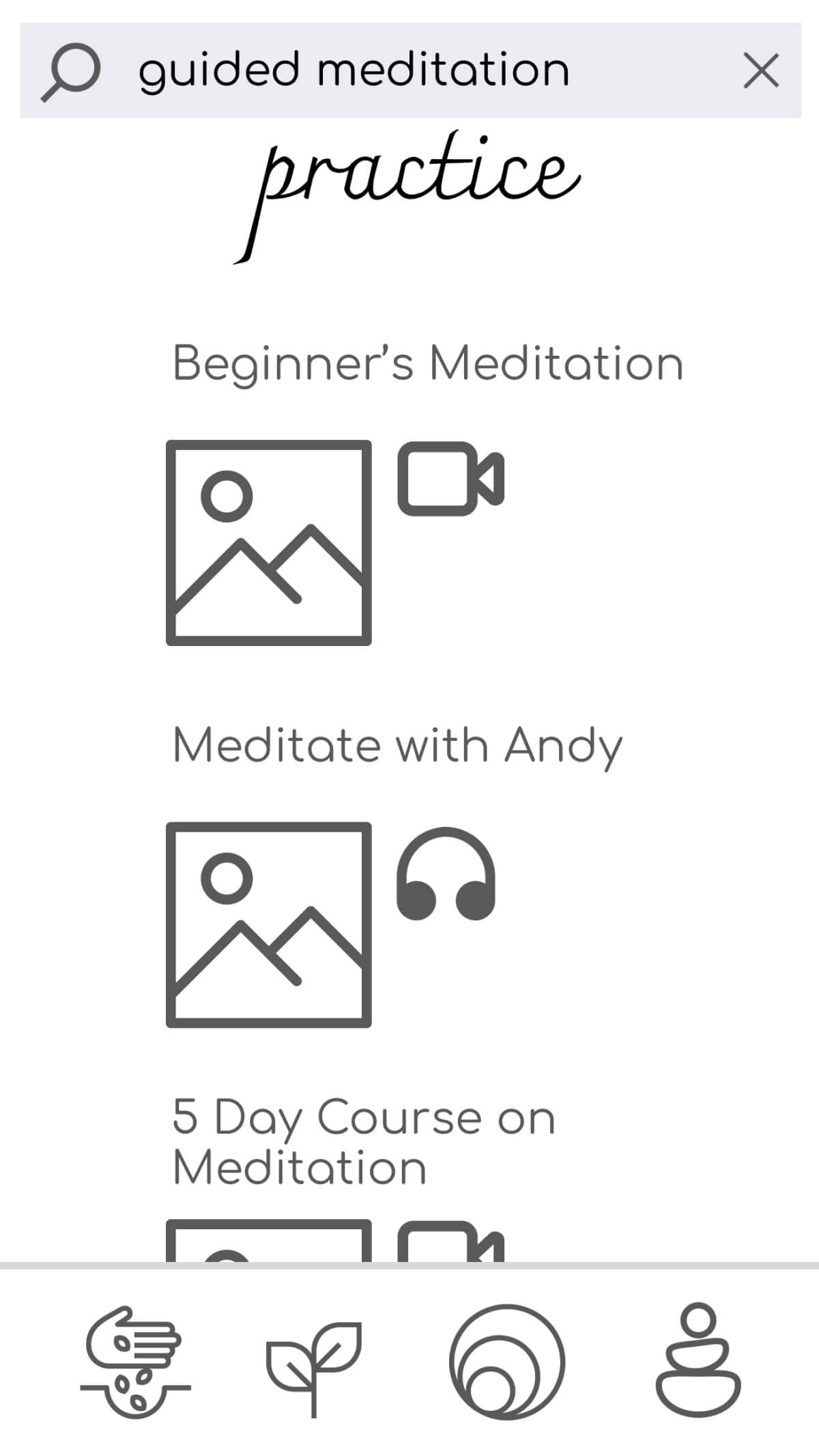
Low-Fidelity Wireframes
Searching for a guided meditation practice and a way to reflect on the experience using a “check in” feature.
Mid-Fidelity Wireframes

Test
After preparing a mid-fidelity prototype that could walk through several of Tula's features, I wanted to understand how my app could be further improved. By conducting usability tests I learned about what was working and what still needed improvements. Large and small errors were discovered and solved due to usability test results.
Usability Testing
I conducted 6 usability tests (3 virtual, 3 in person). The goal was to evaluate the learnability of features and identify errors new users experience when completing tasks. Each session included background questions, open-ended questions, and three tasks. Background questions included: location, experience with similar apps, and knowledge of health and wellness topics. I used video screening, affinity mapping, and a rainbow spreadsheet to analyze results. I evaluated results through measuring errors using Jakob Neilson's error scale.
Key Findings
- Felt relaxed by the minimalist design. “It didn't have a lot of distractions."
- Searching for a practice was easy to do, but choosing a practice was confusing.
- Location of profile and health tracker features were difficult to find and use.
Design Improvements
Errors and issues identified during usability testing led to a few critical design updates.
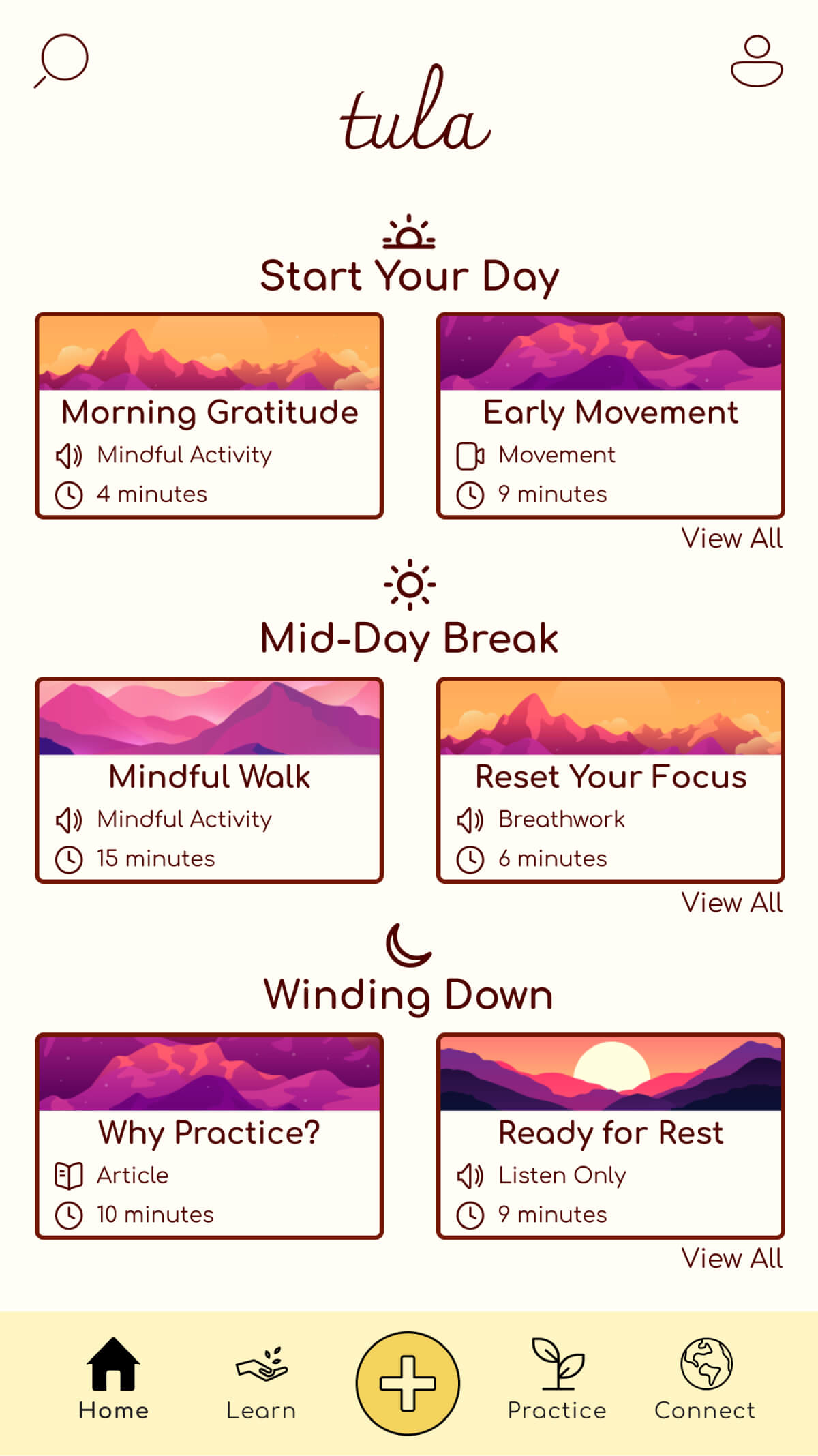
Improving Home Screen Icons
All 6 usability test participants tried to locate the “check in”
feature under the hamburger menu.
I replaced the hamburger menu icon with a search icon, and added a
“+” icon that connects directly to the “check in” feature.

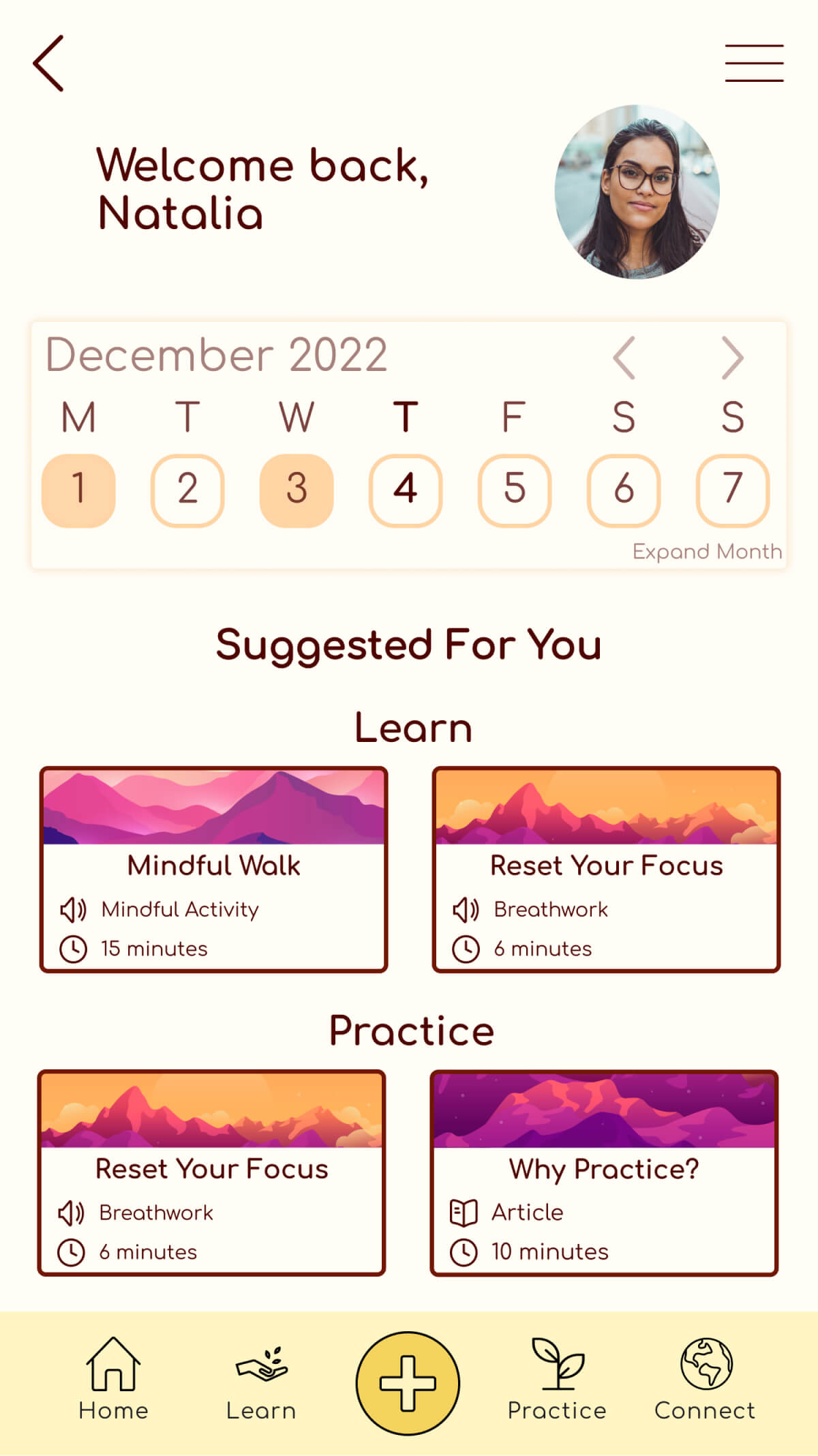
Changing Profile Screen Features
Four participants proved that the profile screen features were not
intuitive or clear.
I redesigned the profile screen to serve fewer purposes (“check in”
feature was removed) so that it could more clearly convey the
purposes that remain.

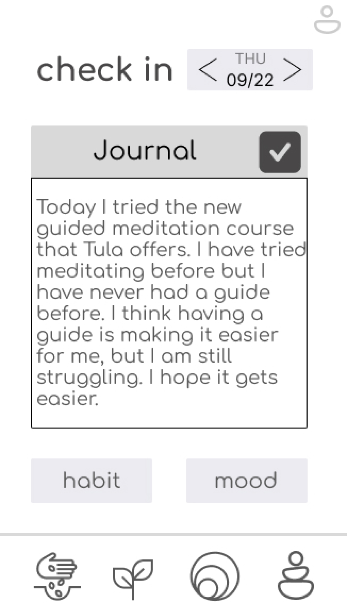
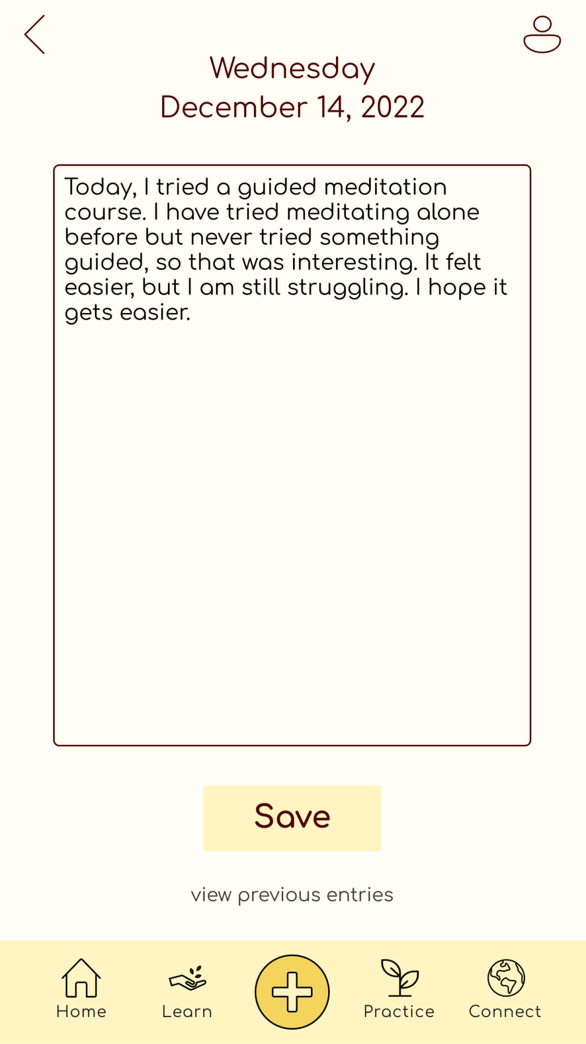
Updating Journal Entry Flow
Four participants were unsure how to finish a journal entry, and
were confused by the buttons leading to other check in features.
I improved the journal entry feature to make it user friendly and
focused on this single feature, rather than multiple features within
this screen.
Reflections on my design process
- Focus on 2-3 requirements. I was eager to create all of my ideas for this design, from unique features to beautiful UI. I learned that I needed to prioritize 2-3 items and focus on refining those before expanding. I referred to app requirements to chose these. I also kept a list of all my ideas that I couldn't get to right away—hopefully I can do them in the future!
- I am not my user. I couldn't have predicted the results of my user research. Listening to responses and paying attention to behaviors was illuminating for my design process, and emphasized the importance of user research in the design process.
- Take advantage of the iteration process. Sketches and mid-fidelity wireframes deserves their time in the spotlight. It doesn't have to take an enormous amount of time, but giving thorough attention to these stages saves enormous amounts of time during later iterations. In the future, I will spend more time walking through multiple low or mid-fidelity wireframes if the project timeline allows it.
